
Look at enough author website examples and you’ll find that many are functional, but few are exceptional. Even bestselling authors often have dated or DIY-looking sites. Commercial success doesn’t automatically translate to a professional website.
The strongest or best author sites are often simple and easy to navigate. When building an author website, start with what your site actually needs to accomplish. When selecting examples, we considered different types of writers and:
Usability: Is the site easy to navigate and clear?
Brand cohesion: Does the site feel like the author, or just a template?
Professionalism: Does it look polished, or slightly unfinished?
What about conversions? Selling books and collecting email subscribers are usually the goals, but a website can only convert the traffic that reaches it. For many authors, traffic is modest. Good visibility can help more of the right people find the site, but believing every author website functions as a sales funnel from the start overstates reality.
Whatever its primary goal, an author site also serves a fundamental purpose: providing a definitive home on the web—a first-party, authoritative source that establishes who you are, what you’ve written, and how your work connects across the web. That gives search engine crawlers and AI systems a clear source for understanding those relationships.
Most authors don’t need an innovative website. They need a very good author website.
Minimalist and Highly Focused
WordPress / LiquidWeb
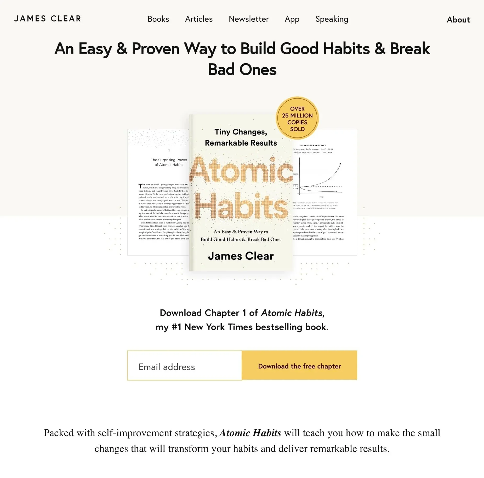
James Clear
James Clear is an example of when a conversion-focused author site makes sense. Its stripped-down design directs visitors toward his newsletter and content, which are central to his business.
But its extreme simplicity works partly because he already has a large audience, extensive content, and strong name recognition. For a lesser-known author, the same approach can feel under-built rather than focused.
Modern & Inviting Author Sites
WordPress / The Hot Brain
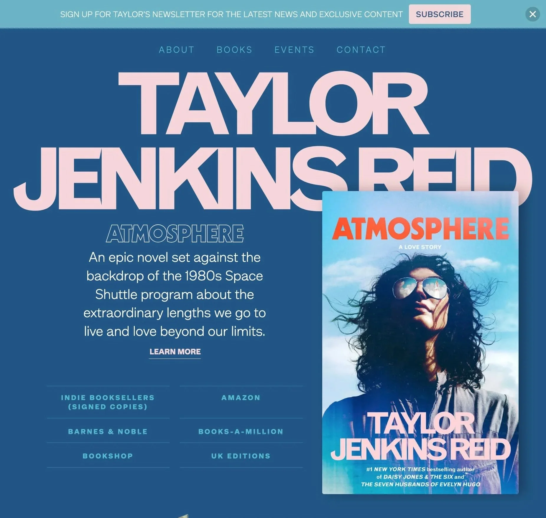
Taylor Jenkins Reid
Reid’s site gives the current book immediate visual priority, then keeps the rest of the experience straightforward: books, author information, events and newsletter. Large-scale imagery and typography add energy without making the structure harder to follow.
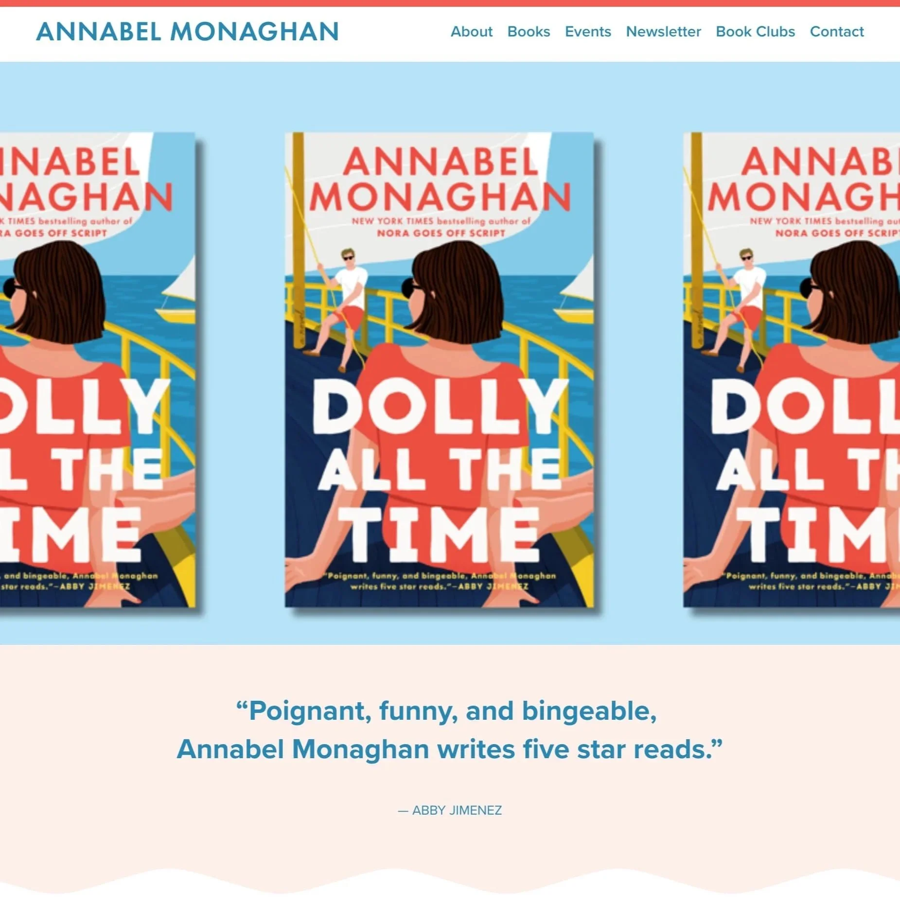
Annabel Monaghan
Monaghan’s site is bright and breezy, but considered. Her book covers supply the color and personality, while the navigation and clear homepage sections keep attention on the author and her work. The color palette shifts with each new release, giving the site a fresh look without changing its underlying structure.
It’s a good example of a conventional author site structure that feels polished rather than generic.
Classic & Professional Author Sites
Classic doesn’t have to mean dated. Author websites tend to stay online for many years, so designs built around strong typography, book imagery, and straightforward navigation can have an advantage: they aren’t tied closely to web design trends.
WordPress / PRH
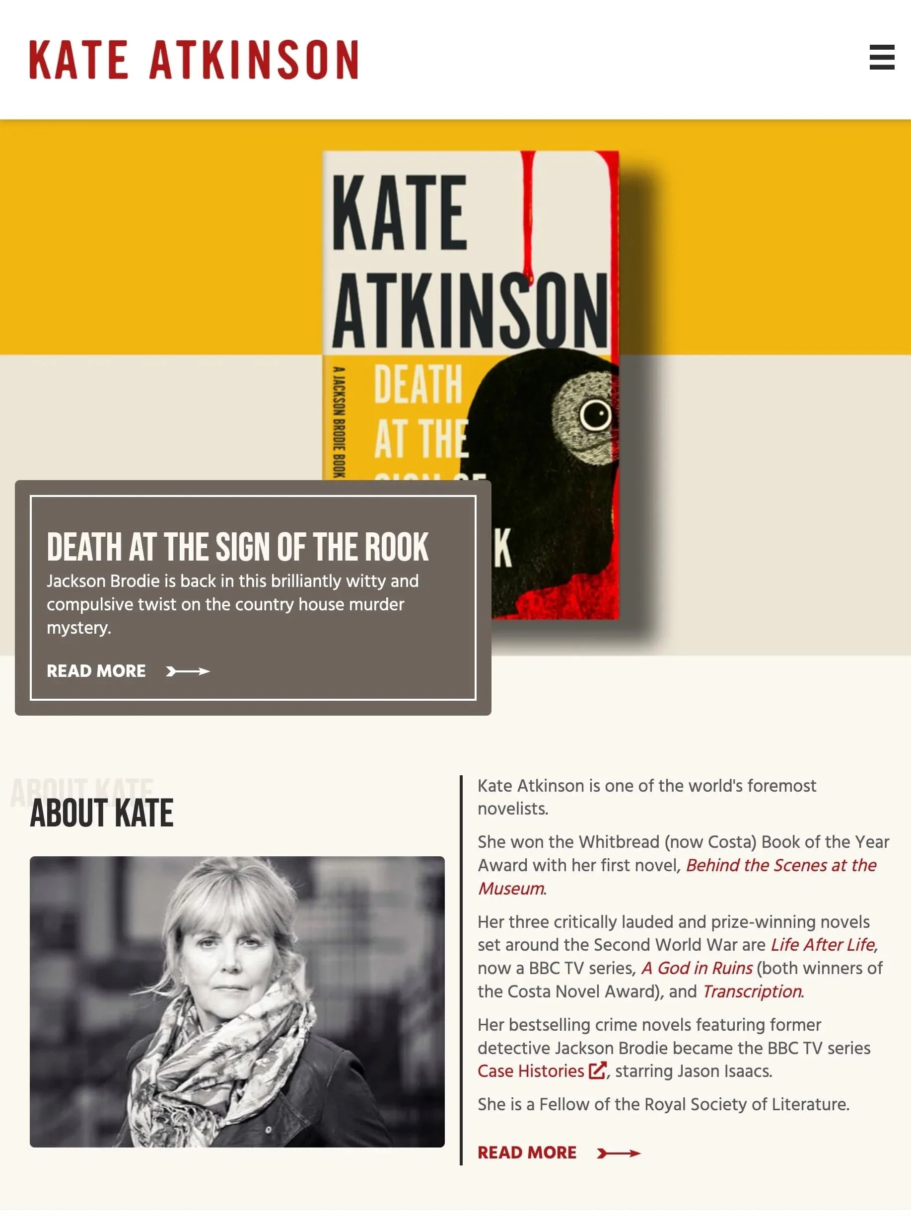
Kate Atkinson
Atkinson’s site uses a traditional author site structure, but oversized book imagery, sans serif font, and a cohesive palette give it a strong editorial identity. It feels literary without becoming fussy or old-fashioned.
Squarespace / Collaborada
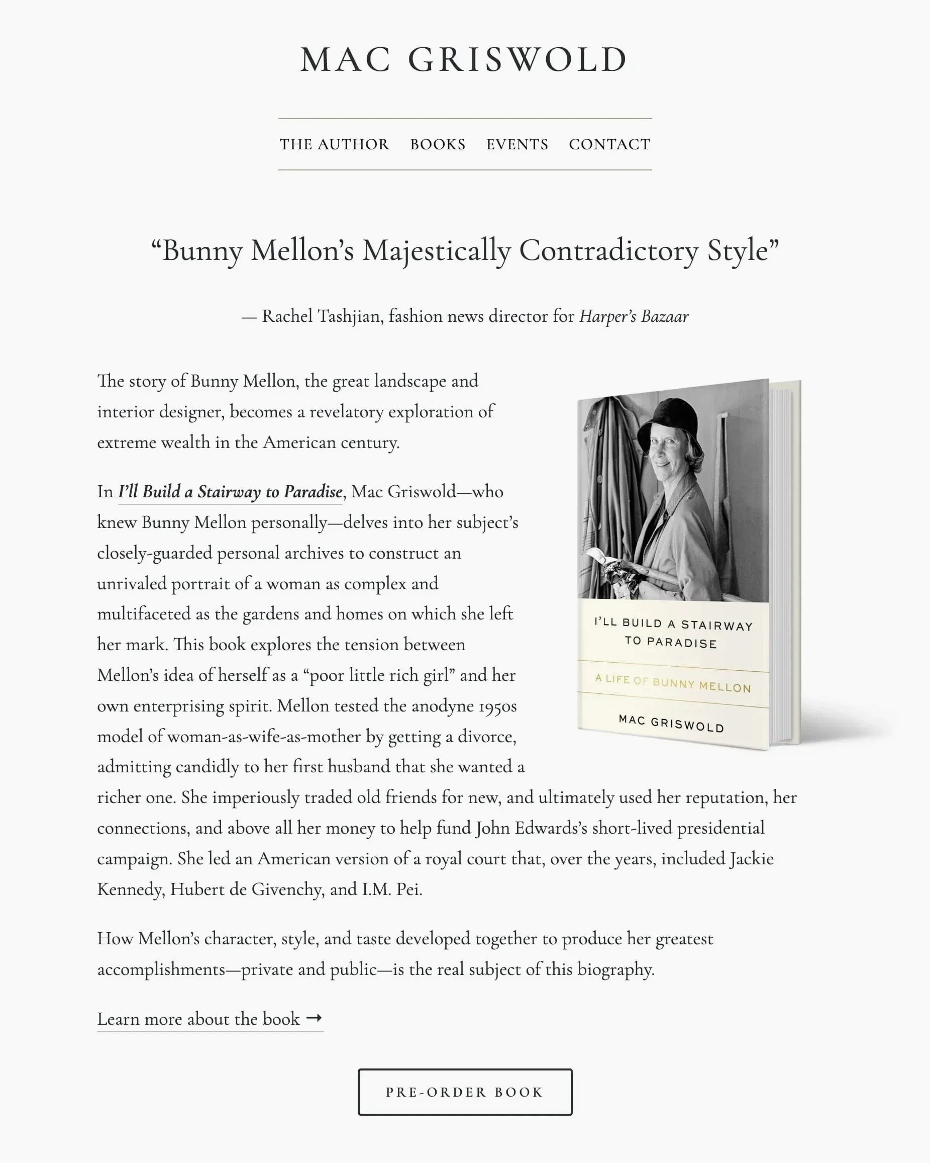
Mac Griswold
Griswold’s site uses a familiar author site structure, but restrained typography and a neutral palette give it an editorial feel. The conservative spirit matches the tone of the books.
This is a good example of how simple design can age well. The site evolved from a layout we created for Rhiannon Navin, whose site has remained on “best author website” lists for years. Straightforward style can have a longer shelf life than trend-driven effects.
Squarespace / Collaborada
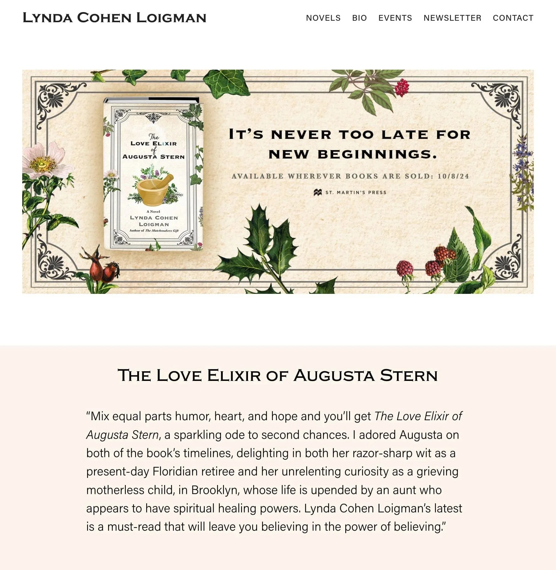
Lynda Cohen Loigman
Loigman’s site puts the newest book first while keeping her backlist, author information, and newsletter easy to find. Book imagery carries most of the visual identity, while the underlying structure stays conventional and easy to navigate.
Books + Expertise
Some authors are also journalists, professors, scientists or researchers. Their websites need to establish a larger body of work and expertise without letting books get lost.
WordPress
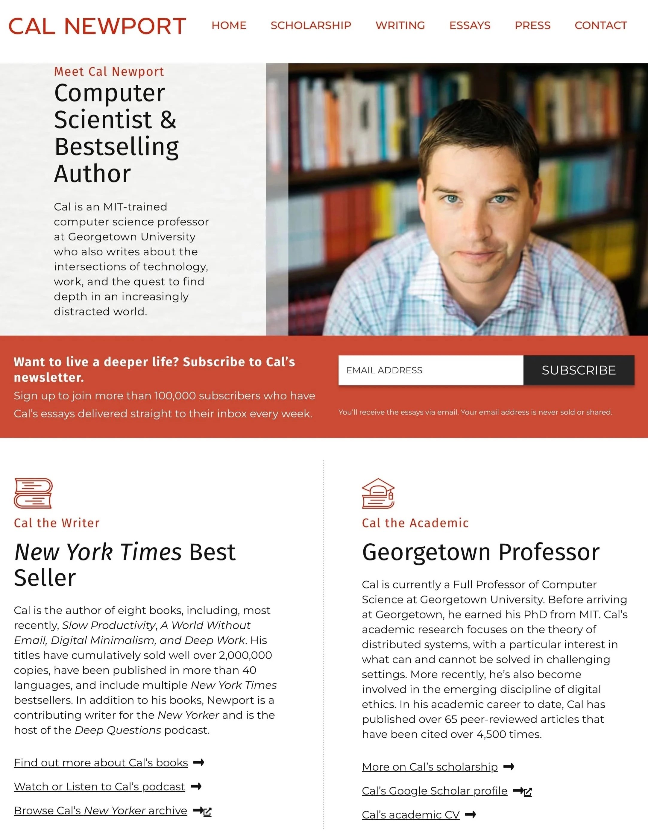
Cal Newport
Newport’s site has a lot of information to accommodate—books, articles, a blog, podcast, newsletter, and academic work—but the different parts feel like pieces of the same body of work rather than competing projects. Books are prominent without being treated as the only reason someone might visit.
WordPress / Global Prairie
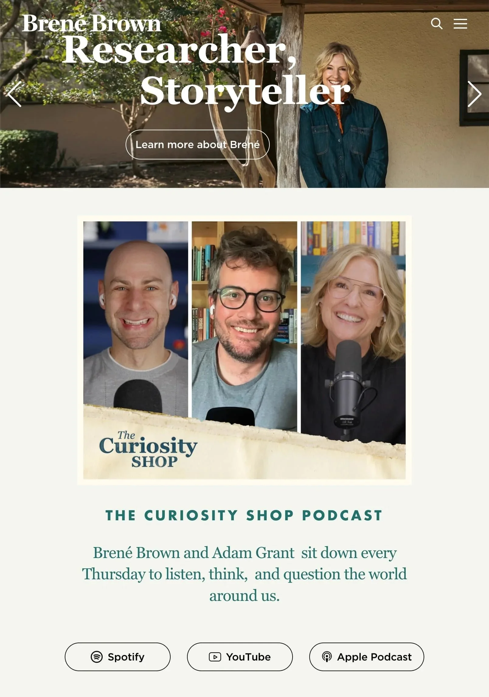
Brené Brown
Brown’s site also has much to organize but uses one of the simplest visual systems in this collection. Large type, generous space, and a restrained palette keep a substantial amount of material from feeling complicated. It isn’t especially innovative or visually surprising, and it doesn’t need to be.
Good web design isn’t the same thing as distinctive web design. Here, the achievement is making a complicated body of work feel simple.
Content‑Rich Author Hubs
For authors working across books, video, podcasts, education and other media, the challenge is less about establishing expertise than giving different audiences clear paths through a large amount of content.
Squarespace / Studio Rubric
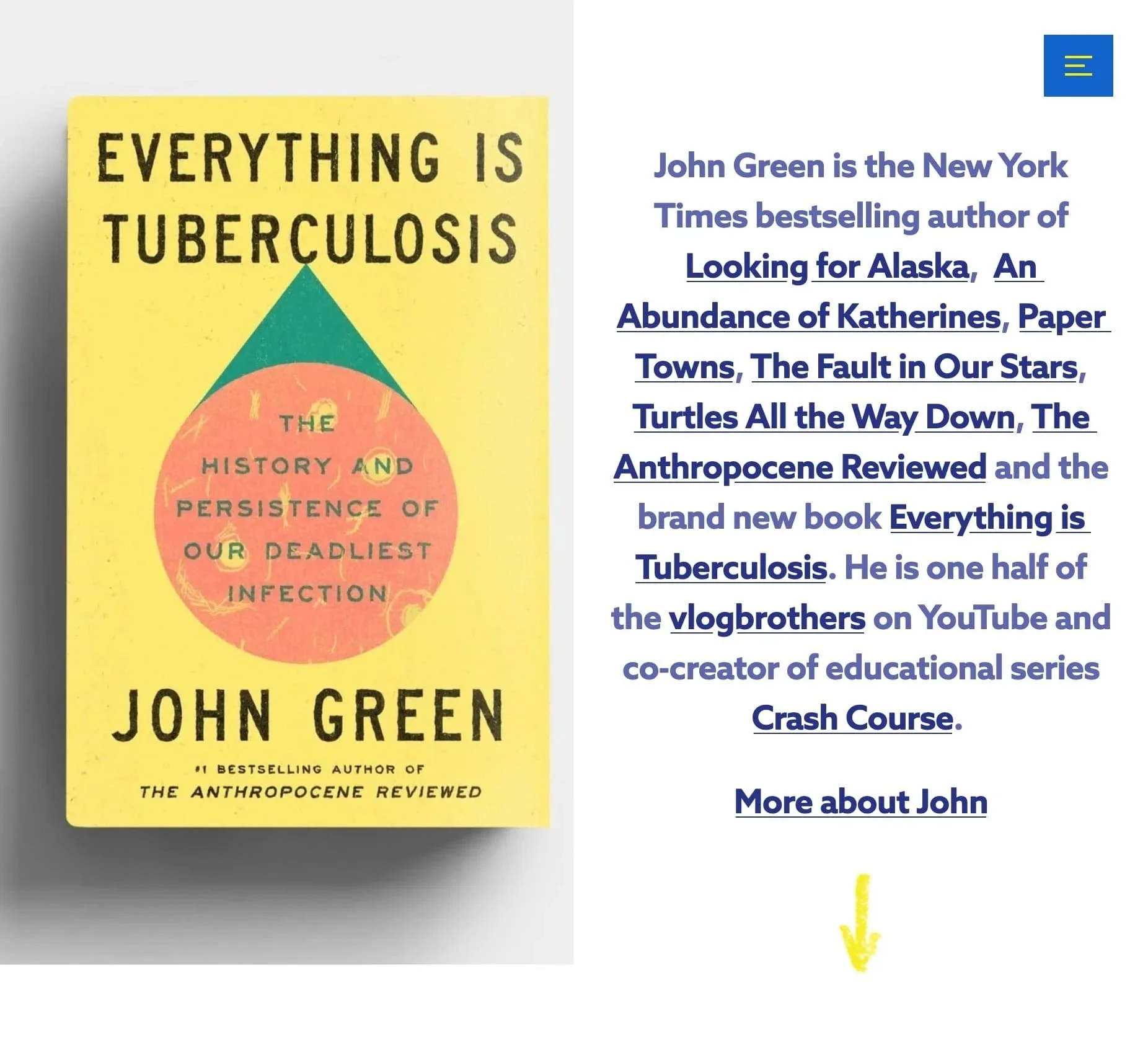
John Green
Green’s site has to accommodate books, podcasts, videos, educational projects and other work without making any one of them his defining identity. An unconventional modular homepage lets visitors move among those projects without forcing everything into a standard author site hierarchy.
There’s a lot here and a large navigation menu, but the density makes sense for the amount of work the site represents.
Squarespace / Collaborada
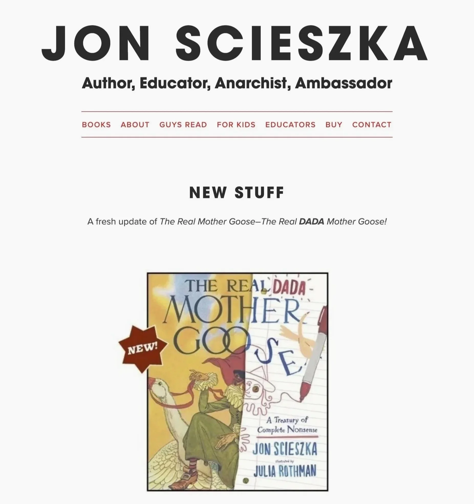
Jon Scieszka
Scieszka’s site has to work for kids, parents and educators while also organizing a large book catalog. Dedicated “For Kids” and “Educators” paths make those audiences explicit, while the playful visual identity keeps the site recognizably his without making it difficult to use.
World-Building Author Sites
Some genre authors extend the fictional world beyond the books themselves. Maps, characters, lore, and atmospheric design can give readers more to explore. But world-building on a website works best when existing readers are interested in exploring that world. A debut fantasy novel doesn’t automatically need maps, elaborate animation, or custom interactions simply because it’s fantasy. These features also make sites more complicated to build, test, and maintain.

WordPress / Infantree
Seth Ring
Ring’s site extends his fantasy worlds beyond the books themselves, using maps, character artwork, and series-specific sections to give readers more to explore.
That ambition comes with a tradeoff: in our testing, the site was slow to load and its navigation behaved inconsistently in Safari.
WordPress / Union Room
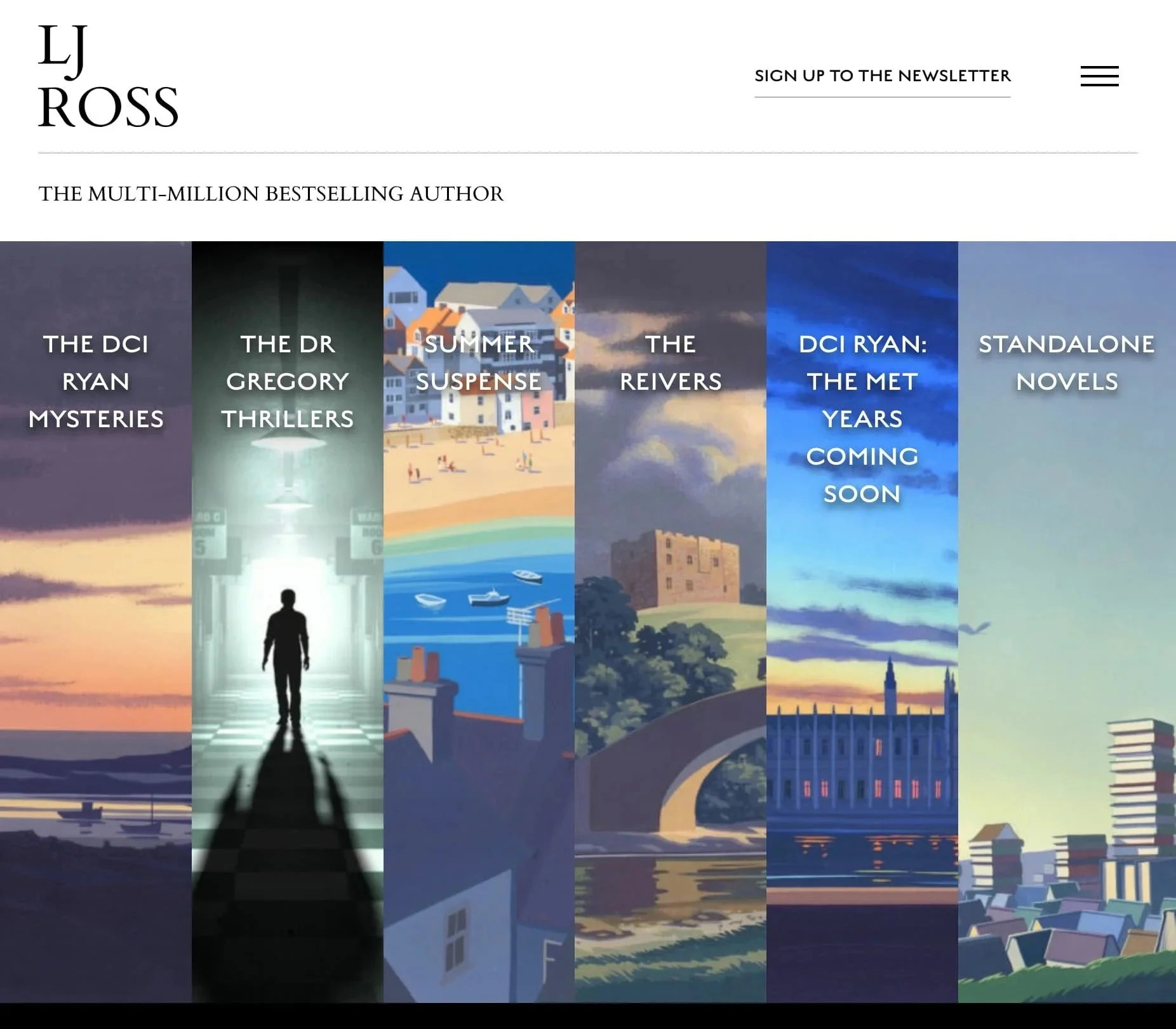
LJ Ross
Ross turns the homepage into a visual entry point to different series, using large atmospheric panels rather than presenting the books in a conventional grid. Readers can choose which series to explore, making the catalog itself part of the site’s visual experience.
The approach puts atmosphere ahead of efficiency, but that tradeoff feels deliberate.
Conceptual / Art-Directed
These sites treat the website itself as part of the creative work rather than simply a container for books and biography. The approach is unusual and highly author-specific, which is precisely why it works in these examples.
Custom-built
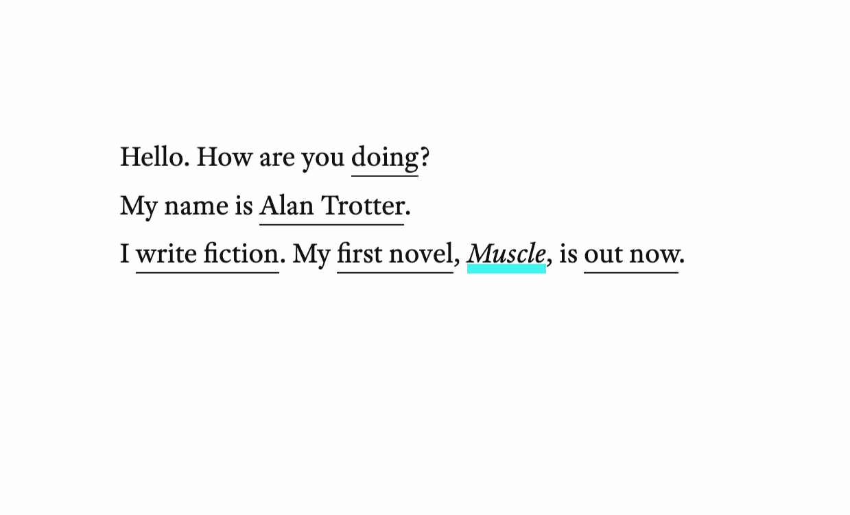
Alan Trotter
Minimal and unconventional, Trotter’s site turns navigation into part of the experience. The unusual structure feels deliberate rather than gimmicky and suits an author whose work is experimental.
WordPress / Simple Thread
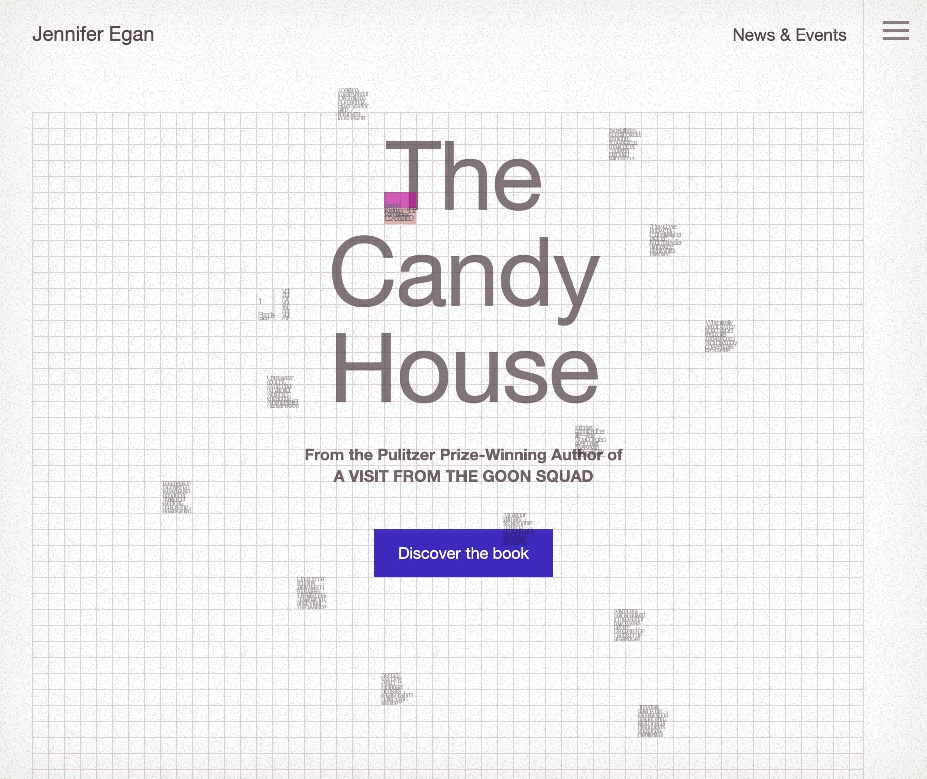
Jennifer Egan
Minimal, abstract, and art-directed to echo her experimental storytelling. The interface itself becomes part of the experience rather than simply presenting information about the author and her books.
A Few Takeaways
There’s no single model for a good author website. A novelist with one book, a professor with a podcast and research archive, and a fantasy author with five interconnected series have very different problems to solve.
More isn’t inherently better. A conversion-focused site makes sense when there is an audience to convert. World-building makes sense when readers want more of the world. And highly original design makes sense if it contributes something to your identity or work.
For many authors, none of that complexity is necessary. A straightforward site will establish the author and their books clearly, look professional, work reliably, and can remain current for years. The author website examples we highlighted aren’t models to copy so much as different solutions to different problems.
Need an Author Website?
We design professional author websites ranging from simple, classic sites to more customized builds.